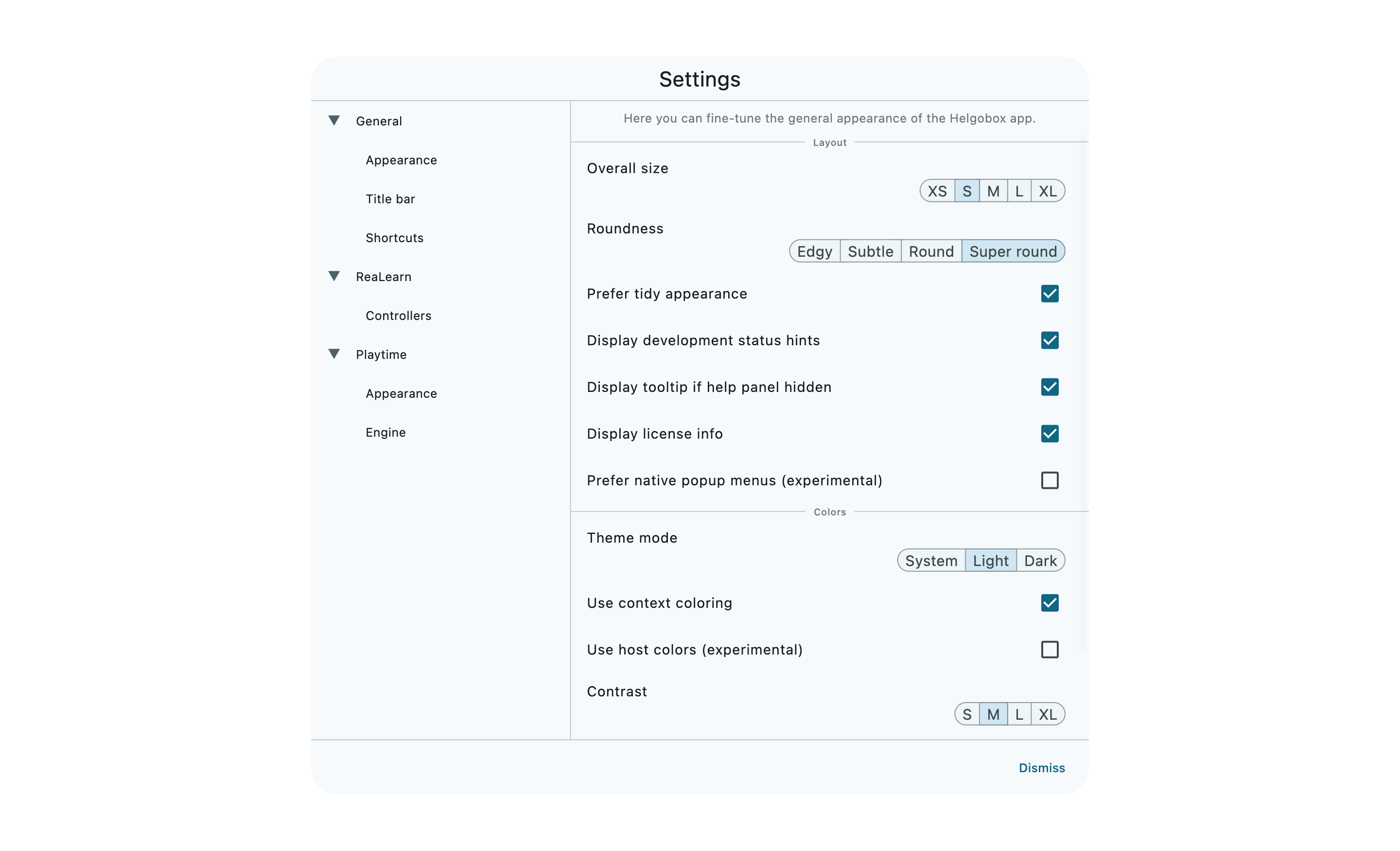
Settings dialog
Appearance
Roundness

Choose whether to round off corners of various user interface elements and how much.
|
For Playtime users
If you want slot cells with rounded corners, play with the Cell color position setting!
|
Prefer tidy appearance

If enabled, the inspector will show dropdown menus even if if they present just a handful of options. This looks more tidy but you will need two mouse clicks to choose an option.
If disabled, it will show all options as buttons instead.
Display development status hints

If enabled, the inspector will display even settings that are not available yet and it will show small annotations about the development state of a feature.
Display tooltip if help panel hidden

If enabled and the help panel in the bottom right corner is not visible, a tooltip will be showed instead.
Display license info

If enabled, the licensee name will be displayed in the window title bar. This only affects commercial Helgobox products, such as Playtime.
Prefer native popup menus (experimental)

If enabled, dropdown and right-click menus will be rendered using your system’s native user interface component.
|
Development status: Feedback wanted!
This doesn’t work particular well at the moment. On Windows, it has caused crashes in the past. |
Theme mode

Switches between dark, light, and automatic theme modes. In automatic mode, the app will follow your system’s theme settings.
Use context coloring

If enabled, some inspector panels will get a special background color that reflects their purpose, such as red for recording and green for playback. This makes it easier to distinguish between the purpose of different settings but it may not go so well with the color design of your theme.


