User interface
This section provides a detailed overview of all elements in Playtime’s user interface.
Main screen
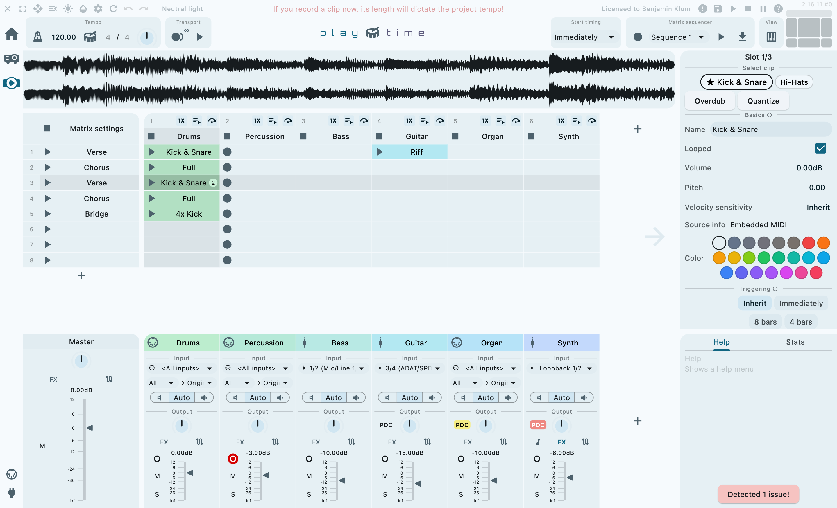
Playtime’s design centers around a single, large main screen, offering streamlined access to its most essential features.

Main screen areas
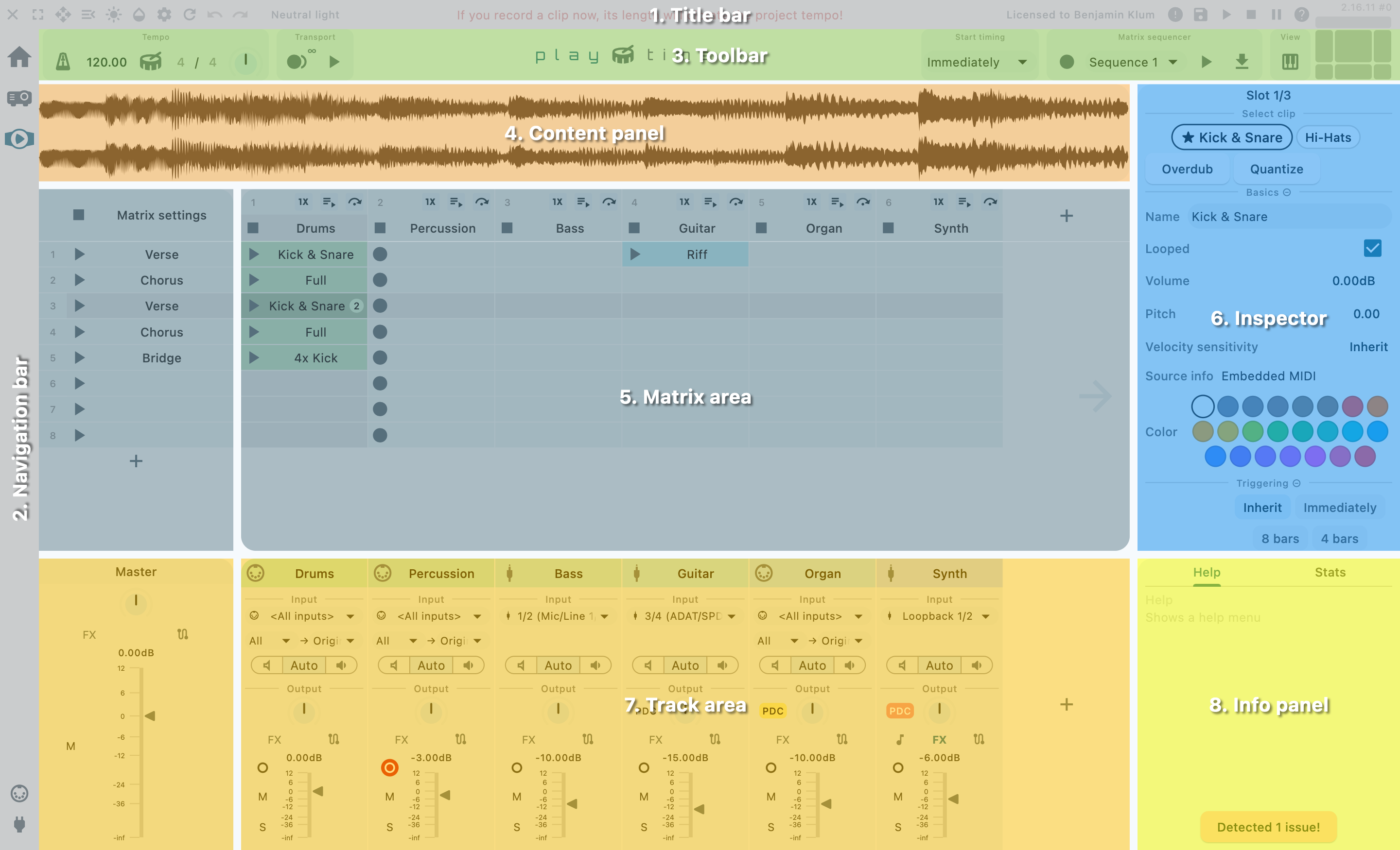
The main screen is divided into distinct areas, each serving a specific purpose.

- Title bar
-
The bar at the top of the app window is the Title bar. It primarily provides general Helgobox functions that are not specific to Playtime, such as window controls, access to settings, and quick access to the REAPER transport.
- Navigation bar
-
The vertical bar on the left is the Navigation bar. Its primary function is to navigate between different Helgobox user interface pages.
- Toolbar
-
The bar directly below the window title bar is the Playtime toolbar. It provides quick access to essential performance controls, including play/stop, tempo adjustments, and more.
- Content panel
-
This area appears when you double-click an audio clip. At the moment, it only contains a waveform view.
- Matrix area
-
The large central area is the matrix area. It displays the Matrix, which is the very core of Playtime.
- Track area
-
The area at the bottom is the track area. It displays the master output track at the very left, followed by the column tracks. The tracks are arranged horizontally, mirroring the layout of REAPER’s mixer control panel.
- Inspector
-
The vertical panel on the right side is the inspector. It displays detail settings for the currently selected element in the Matrix area or Track area.
- Info panel
-
The area at the bottom right is the info panel. It offers context-sensitive help and displays engine statistics.